

Start by aggregating holdings across every account and building three visuals: a pie or donut chart comparing current versus target allocation, a stacked time-series showing drift, and a treemap or correlation scatter that exposes concentration risk. Together, these catch the vast majority of allocation problems in one sitting. Asset allocation visualization only works when it starts with complete data, so your first move is pulling every account, including the ones you tend to forget about, into one place.
Your immediate next step: consolidate holdings from all brokerage, retirement, and cash accounts, then generate that pie or donut chart. It will show you allocation drift faster than any spreadsheet formula.
- Pie/donut: current vs. target allocation, built first
- Stacked time-series: how your mix has drifted over months or years
- Treemap or correlation scatter: where concentration is hiding
Pro Tip: Pick a tool that supports multi-account CSV import and export before you invest hours building charts by hand. You'll rebuild that work the moment you add a new account.
Key Takeaways
Accurate asset allocation visualization depends on consolidating every account, including illiquid holdings, before choosing which chart type to build.
| Point | Details |
|---|---|
| Start with three visuals | Build a pie/donut, stacked time-series, and treemap before adding anything more complex. |
| Consolidate before charting | Aggregate all accounts and include illiquid assets like art or private equity. |
| Normalize currency exposure | Use a consistent reference rate to avoid underestimating foreign exchange risk. |
| Set tolerance bands | Use a band like ±5% around targets to trigger clear, actionable rebalancing. |
| Use an integrated platform | GCA-FopFo's BoxAlong™ and Currencida™ consolidate liquid and illiquid holdings into one accurate visualization. |
Table of Contents
- What Are the Main Types of Asset Allocation Charts?
- What Should You Look for in an Interactive Visualization Tool?
- How Do You Build a Visualization From Your Own Holdings?
- How Do You Read These Charts Without Getting Fooled?
- How Full Option Family Office Closes the Visualization Gap
- What This Guide Gets Right (and Where Most Advice Falls Short)
- See Your Whole Portfolio, Not Just Your Brokerage Slice
- Primary Sources for Asset Allocation Data
- Sources
What Are the Main Types of Asset Allocation Charts?
Different charts answer different questions, and using the wrong one wastes time. A pie chart won't show you drift over time, and a time-series won't tell you which single stock is quietly dominating your portfolio.
Pie and donut charts give you a snapshot: how much is in equities, bonds, cash, and alternatives right now versus your target. They're the fastest way to check if you need to rebalance today.
Treemaps show concentration by individual holding or sector, sized by dollar value. If one tech stock is eating 40% of your portfolio, a pie chart might hide it inside an "equities" slice, but a treemap puts it front and center.
Stacked area or time-series charts track how your allocation has shifted month over month. This is where you catch slow, silent drift, the kind that happens when winners keep winning and nobody rebalances.
Efficient frontier and risk-return scatter plots help when you're optimizing, not just monitoring. They plot expected return against volatility for different allocation mixes, which is useful when you're deciding whether to add more bonds or take on more equity risk.
Correlation matrices and scatter plots reveal exposures that look diversified on paper but move together in practice. Two "different" holdings can still crash on the same day if they're driven by the same macro factor.
- Rebalance check: pie/donut
- Concentration review: treemap
- Drift tracking: stacked time-series
- Optimization conversation: efficient frontier
- Hidden correlation: scatter or matrix
Match the visual to your immediate goal. A quarterly reporting deck needs a time-series; a Tuesday-afternoon rebalance check needs a pie chart and nothing more.
What Should You Look for in an Interactive Visualization Tool?
Not every asset allocation visualization tool does the same job. Basic tools draw a chart from a spreadsheet. Better ones turn that chart into a decision.
- Multi-account aggregation with customizable asset-class mapping, so a fund held at three different brokerages still counts as one line in your equities bucket.
- Rebalancing action lists and tax-aware trade suggestions that translate a chart into an actual order ticket, not just a pretty picture.
- Backtesting and Monte Carlo scenario support, so you can test how a given allocation mix would have performed historically or under thousands of simulated market paths.
- Interactive sliders for time period and target allocation, plus CSV/JSON import and export and API access for automation.
- Transparent assumptions, including which historical returns dataset it uses, how it treats inflation, and how it handles currency conversion.
Free tools tend to cover the basics well. Many let you import a CSV and generate a clean pie chart with a simple rebalancing suggestion, but they often stop short of consolidating multiple accounts or accounting for illiquid holdings. Paid platforms and portfolio backtesting tools go further, layering in historical scenario testing so you can see how a 60/40 mix would have weathered 2008 or 2022 before you commit new capital to it.
- Free tools: good for a single-account snapshot
- Paid platforms: better for backtesting, tax logic, and multi-account views
- Enterprise or family-office suites: best for illiquid assets and advisor collaboration
How Do You Build a Visualization From Your Own Holdings?
You don't need software to start. You need clean data and a consistent method.
- Gather holdings. List every account, holding name, share count, and current market value. Include illiquid assets, real estate, private equity, art, using your best current estimate rather than skipping them.
- Normalize and map. Convert foreign holdings to a single currency using a consistent reference rate, such as the ECB's euro foreign exchange reference rates, then map each holding to a fixed taxonomy: US large cap, international equity, bonds, alternatives, cash.
- Calculate weights and build the visuals. Divide each holding's value by total portfolio value to get percent weight. Build your pie/donut for the current snapshot, a stacked time-series for drift, and a treemap for concentration.
- Add target bands and rebalancing rules. Set a tolerance band around your target allocation. When a category drifts outside that band, generate a trade list to bring it back in line, and write down your assumptions so you can revisit them later.
- Export and share. Save the charts as PNG and the underlying data as CSV, then attach your assumptions when sending the package to an advisor or family member.
| Step | Output |
|---|---|
| Gather holdings | Complete list of accounts, values, and asset types |
| Normalize and map | Currency-adjusted values sorted into asset classes |
| Calculate and visualize | Pie/donut, stacked time-series, treemap |
| Set bands and rebalance | Trade list for out-of-band categories |
| Export and share | PNG charts and CSV data package |
Pro Tip: Document your data source and the date you pulled it directly on each chart. A visualization without a timestamp is a guess dressed up as a fact.
How Do You Read These Charts Without Getting Fooled?
A chart is only as honest as the data behind it, and a few common mistakes turn a useful visual into a misleading one.
Percent weights can hide dollar concentration. A holding that's "only 8%" of your portfolio might still be your single largest position in absolute terms if your portfolio has grown. Show both percent and dollar figures side by side when the stakes are high.

Treemaps expose concentration that pie charts smooth over. Check both sector-level and individual-holding-level concentration. Advisors consistently find that once a portfolio is fully visualized, clients discover their actual exposure looks nothing like what they assumed, often more concentrated in a single name or sector than they realized.
Currency exposure gets underestimated without a proper breakout. If a third of your equity holdings are denominated in a foreign currency, that's a real risk layer your allocation chart needs to show, not bury inside an "international equity" label.
- Show percent and dollar weights together
- Check concentration at both the sector and holding level
- Break out currency exposure separately
- Include illiquid assets rather than assuming liquidity equals diversification.
- Label the time window and data source on every chart
Historical return series, like the long-run dataset NYU Stern maintains for stocks, bonds, and bills, are a standard backtesting input. But past performance over one stretch of decades doesn't guarantee the next stretch looks the same, so treat any backtest as a scenario, not a forecast.
How Full Option Family Office Closes the Visualization Gap
Most brokerage dashboards only show what's held at that one brokerage. Real portfolios span multiple custodians, currencies, and asset types that never show up on a standard statement, including art, private businesses, and real estate.
GCA-FopFo's four applications work together to close that gap. Familigi™ maps family structure and ownership, BoxAlong™ consolidates holdings and generates the visuals themselves, Currencida™ normalizes values across physical, virtual, and crypto currencies, and SEBAA™ layers in benefits, payroll, and investment accounts. The result is one visualization built from every asset a family actually owns, not just the ones sitting in a brokerage account.
- Scheduled data refreshes so charts stay current without manual re-entry
- Automated rebalancing action lists tied directly to your target bands
- Exportable reports formatted for both family members and outside advisors
- Illiquid asset integration, so appraised art or private equity holdings show up in the same treemap as your equities
Vanguard's own research on model portfolio allocation makes the underlying point clear: the mix between stocks and bonds drives your entire range of outcomes, so seeing that mix accurately matters more than almost any other single input into your financial plan.
What This Guide Gets Right (and Where Most Advice Falls Short)
Most articles on this topic treat visualization as a nice-to-have layer on top of a spreadsheet. That gets the priority backward. A number on a page rarely changes behavior, but a treemap showing one stock eating 35% of a portfolio tends to prompt action within the week. Advisors have long noticed that the visual "shock" of a chart moves people to rebalance faster than a numerical report ever does.
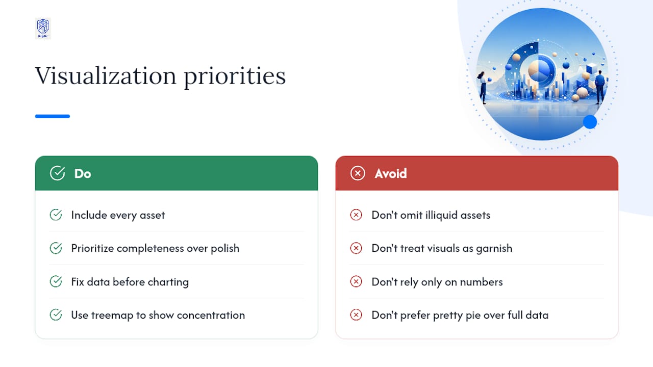
The bigger gap, though, is illiquid assets. Conventional wisdom treats "asset allocation" as a stocks-and-bonds exercise, which works fine until a family's art collection or private equity stake turns out to be worth more than their entire brokerage account. Leaving those out doesn't simplify the picture. It falsifies it.
If you take one thing from this guide, prioritize completeness over polish. A rough treemap that includes every asset you own beats a beautiful pie chart that's missing a third of your net worth. Fix the data first. The chart type matters far less than what's actually being counted.
— GCA
See Your Whole Portfolio, Not Just Your Brokerage Slice
Most allocation tools show you a partial picture: what's sitting in one brokerage account, refreshed whenever you remember to check. GCA-FopFo is built for families and advisors who need the full picture, liquid and illiquid, across every currency and every account, updated automatically instead of rebuilt by hand each quarter.
That matters most for the exact blind spot this guide covers: art, private equity, real estate, and multi-currency holdings that standard dashboards leave out entirely. BoxAlong™ consolidates those holdings into one view, Currencida™ normalizes the currency math, and SEBAA™ folds in your benefits and investment accounts so the resulting visualization reflects everything you actually own, not just what one custodian reports.
If you're tired of stitching together spreadsheets from three different institutions to get an honest allocation picture, start exploring the Full Option Family Office platform and see what a consolidated visualization looks like with your own holdings.
Primary Sources for Asset Allocation Data
- NYU Stern historical returns dataset for long-run stock, bond, and bill returns
- Vanguard's asset allocation model portfolios
- Baker Tilly's family wealth insights on illiquid asset integration
- ECB euro foreign exchange reference rates for currency normalization